The Progress Bar Control allows the easy display of a progress metric or quantity to the agent.
This Control is part of the Basic Control pack, and will always be available.
How To
Add a Progress Bar to the Page. The options and style can be configured in the Options tab and Styling tab of the Field Properties, and Validation and Formatting can be applied if desired.
Progress Bar Fields can be styled in a Stylesheet by referencing the control-progress-bar class.
The Progress Bar Control has three unique options available in its Options tab:
Option
Description
Max Value
The maximum value that the Progress Bar can take. This affects both the visible bar and label.
Show Label
Choose whether a label is displayed inside the Progress Bar.
Label Value
If Show Label is enabled, then this controls whether the value of the Progress Bar is displayed as a number, a percentage, or a fraction of the Max Value.
Notes
The Max Value should be an integer (whole number).
If the value of the Progress Bar is higher than its Max Value, then the displayed value will be capped to the Max Value.
If either the Value or Max Value are non-numeric, then the Progress Bar will appear empty.
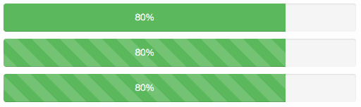
By applying Bootstrap Progress Bar classes to the Additional Classes of the Progress Bar stylable element, it is possible to easily change the colouration (e.g., progress-bar-success), apply a striped fill (e.g., progress-bar-striped), or even animate a striped fill (e.g., progress-bar-striped active):